25 Squarespace Font Pairings to Elevate Your Website

There are over 1,600 fonts in Squarespace, so it’s no surprise that picking just a couple of them for your own website can feel overwhelming.
Why do font choices matter?
Fonts are often the first design element people notice when they land on your website. Your choice of font will communicate mood and tone, and will play a huge role in how other people perceive your brand.
Different Font Types
Serif
The fonts that have a small line or feet (called “serifs”) at the end of the letters. They feel classic, trustworthy and formal. Examples include Times New Roman, Playfair Display and Merriweather.
Sans Serif
These are clean and simple letter forms without strokes at the end of the letters. They feel modern, minimal and friendly. Examples include Open Sans, Montserrat and Arial.
Slab Serif
Slab Serif fonts have thick, slab like serifs. They’re not as delicate as regular serif fonts. They feel bold and powerfull Examples include Rockwell and Zilla Slab.
Script
These look like calligraphy or cursive handwriting. They feel romantic, decorative and expressive. Examples include Dancing Script and Allura.
Display / Decorative
These are highly stylised and attention grabbing fonts for visual impact. They feel loud and artistic. Use display and decorative fonts for titles and headings only, not for body text. Examples include Bebas Neue and Lobster.
Monospace
Every character in a monospace font takes up the exact same width. These fonts feel techie and minimal. Examples include Courier and Roboto Mono.
Top tips for choosing font pairings
Limit the number of fonts you choose
When picking out the fonts for your website, stick to just 2 fonts (3 maximum!). Too many fonts on a website can make the design feel chaotic and it can also weaken your brand identity. But if you stick to just 2 fonts on your website (and across your other marketing), your brand will appear cohesive, professional, polished and trustworthy.
Prioritise legibility
The main goal of the fonts that you choose is readability. Decorative or script fonts should be used as accents only and not for headings or paragraphs. If you choose a display font then use it for headers only, not for paragraphs. If you’re going back and forth between 2 or 3 font choices then pull up a Google doc and look at the fonts side by side. Pick the one that is easier to read.
Complement and contrast
For a cohesive look on your website it is important to choose fonts that complement each other. But it’s also important that they have enough contrast so users can distinguish between headings, subheadings and paragraphs. Some ways you could make sure that your fonts contrast are by thinking about the size, weight and style of font. Heading text normally is bigger in size. You could also pair a bold font with a regular or light one. Or you could contrast the fonts by style by pairing a serif font with a sans serif.
Consistency
Use the same fonts throughout your whole website. This makes for a cohesive look and a more professional and polished website overall. Extend the use of your chosen fonts to any marketing materials such as social media posts, business cards, leaflets etc. This strengthens brand identity and builds trust.
25 Squarespace Font Pairings
In this blog post, I’ve got 25 curated font pairings. All the fonts are native to Squarespace so if you decide to go with one of these pairings for your own website, there is no need to upload font files or write a single line of code.
I have used the same dummy text in all the examples and I have included a mix of bold, italic and uppercase so you can really get a feel for each font pairing.
I made all the examples in a website template and I did not manually adjust the font settings.
Playfair Display & Source Sans Pro

Heading: Playfair Display
Paragraph: Source Sans Pro
The Vibe: Editorial and Modern
2. Montserrat & Open Sans

Heading: Montserrat
Paragraph: Open Sans
The Vibe: Clean and Professional
3. Raleway & Lato

Heading: Raleway
Paragraph: Lato
The Vibe: Minimal and Sleek
4. DM Serif Display & Work Sans

Heading: DM Serif Display
Paragraph: Work Sans
The Vibe: Elegant and Fresh
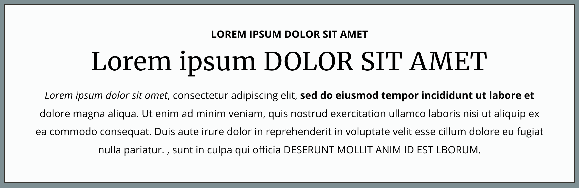
5. Libre Baskerville & Roboto

Heading: Libre Baskerville
Paragraph: Roboto
The Vibe: Classic and Readable
6. Abril Fatface & Karla

Heading: Abril Fatface
Paragraph: Karla
The Vibe: Bold and Approachable
7. Oswald & Merriweather

Heading: Oswald
Paragraph: Merriweather
The Vibe: Strong and Literary
8. Cormorant Garamond & Raleway

Heading: Cormorant Garamond
Paragraph: Raleway
The Vibe: Refined and Clean
9. Josefin Sans & Lora

Heading: Josefin Sans
Paragraph: Lora
The Vibe: Retro and Graceful
10. Anton & Inter
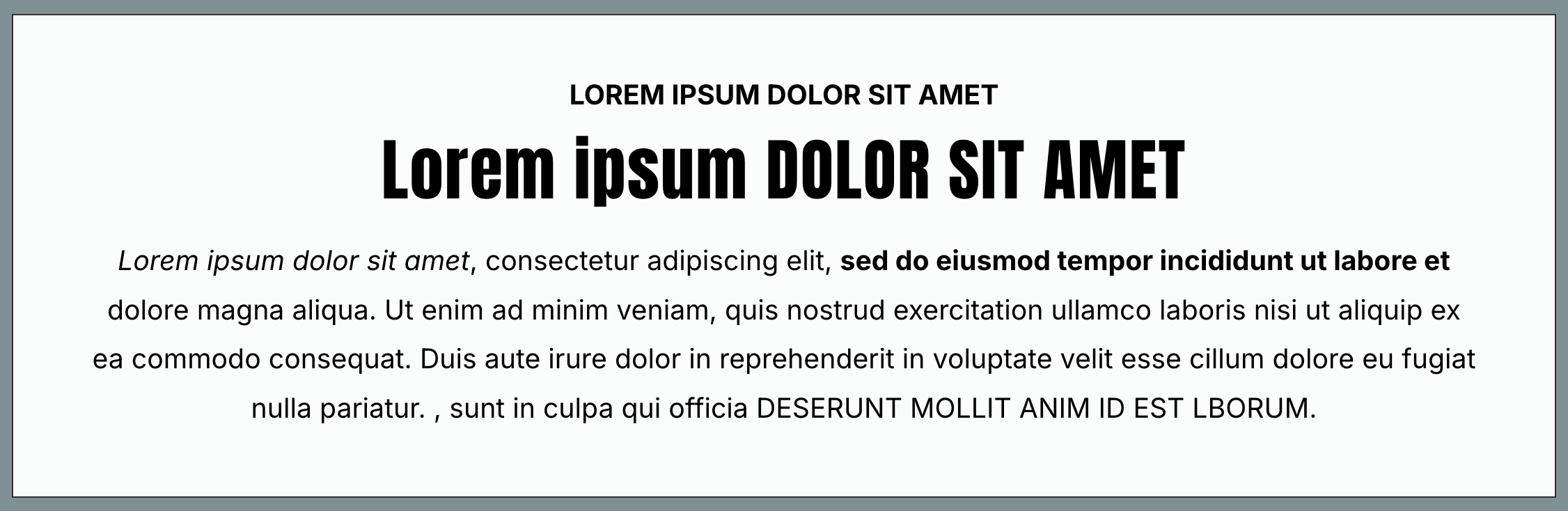
Heading: Anton
Paragraph: Inter
The Vibe: Loud and Modern
11. Merriweather & Open Sans
Heading: Merriweather
Paragraph: Open Sans
The Vibe: Traditional and Versatile
12. Bebas Neue & Nunito Sans

Heading: Bebas Neue
Paragraph: Nunito Sans
The Vibe: Edgy and Friendly
13. Zilla Slab & Roboto

Heading: Zilla Slab
Paragraph: Roboto
The Vibe: Editorial and Balanced
14. Arvo & Lato

Heading: Arvo
Paragraph: Lato
The Vibe: Modern and Clean
15. Quicksand & Lora

Heading: Quicksand
Paragraph: Lora
The Vibe: Soft & Humanist
16. PT Serif & PT Sans

Heading: PT Serif
Paragraph: PT Sans
The Vibe: Professional and Neat
17. Fira Sans Condensed & Fira Sans

Heading: Fira Sans Condensed
Paragraph: Fira Sans
The Vibe: Technical and Minimal
18. Cinzel & Noto Sans

Heading: Cinzel
Paragraph: Noto Sans
The Vibe: Classical and Modern
19. Bitter & Inter

Heading: Bitter
Paragraph: Inter
The Vibe: Structured and Sleek
20. Syne & Manrope

Heading: Syne
Paragraph: Manrope
The Vibe: Creative and Fresh
21. Manrope & Libre Baskerville

Heading: Manrope
Paragraph: Libre Baskerville
The Vibe: Crisp and Intelligent
22. Alice & Source Sans Pro

Heading: Alice
Paragraph: Source Sans Pro
The Vibe: Vintage and Modern
23. Vollkorn & Lato

Heading: Vollkorn
Paragraph: Lato
The Vibe: Stately and Clean
24. Cabin & Roboto

Heading: Cabin
Paragraph: Roboto
The Vibe: Friendly and Crisp
25. Space Grotesk & IBM Plex Sans

Heading: Space Grotesk
Paragraph: IBM Plex Sans
The Vibe: Futuristic and Readable
Found this post useful? You’ll also like:
◇ How to Download Adobe Fonts onto Your Mac
◇ 8 Features of a High Converting Website
↓ Liked this post? Pin it to Pinterest ↓

